Designing the One-Stop Shop for 800 Atlassian Partners
90 Seconds to Understand Partner Central
Partner Central is Atlassian's home for Channel Partners, the ~800 organisations that sell, implement, and support Atlassian products around the world. It's where they onboard, get enabled, manage their programs, and work opportunities.
When I joined, it was a two-engineer beta with no design foundation. The intent was good: take the patchwork of tools partners had been navigating for years and bring them into one place. But without structure underneath, Partner Central was quietly recreating the same fragmentation inside a single product.

My Role
I was the first designer on Partner Central. My job was to set a foundation that would hold as the team grew.
Four things, mostly:
- Direction. Ran a workshop with product and engineering to agree on design principles, and kept them alive in actual decisions.
- Architecture. Rebuilt the IA around how partners work, not how our systems are organised.
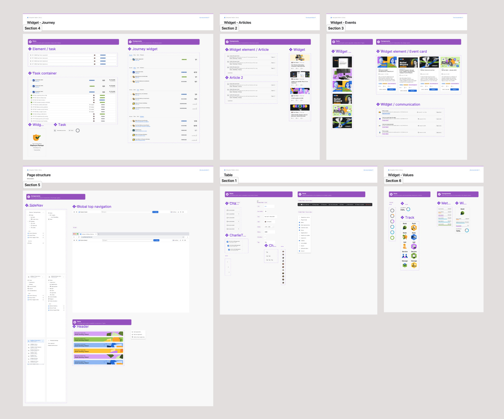
- Craft. Brought every surface up to Atlassian Design System standards and shipped a component library so the next designers wouldn't start from scratch.
- Beyond the brief. Built a Revenue Experience Blueprint that reframed leadership conversations from “fix this feature” to “we have a system problem.”
The Opportunity
Putting everything in one place doesn't make it coherent. Partners still didn't know where to go, how things connected, or what to do next. The fragmentation hadn't gone away, it had just moved inside a single product.
The numbers told the same story. Routine workflows still pulled partners across five or six tools. Onboarding could take up to two weeks. And roughly 900 support tickets a month existed purely because partners couldn't do things themselves, growing 7% month over month as the program scaled.
The real opportunity was giving the consolidation meaning: organising Partner Central around how partners actually think and work, so the platform could tell them where they stood and what to do next.
Partner Central in beta, before any design involvement.
Outcome & Impact
Onboarding stopped being a multi-day slog and became a self-serve flow partners could finish in under a minute. The new architecture made the platform legible: partners could see where they stood and what to do next without a Partner Manager translating it for them.
Beyond the numbers, this work left Partner Central with a structural foundation: design principles, a domain-driven IA, a component library, and the Revenue Experience Blueprint, all still shaping how the platform evolves. With the system organised around how partners actually work, we can start retiring the legacy tools Partner Central was built to replace, unlocking over $2M a year as the consolidation lands.
Solution: Structuring the Platform
Rather than redesigning screens, I focused on the structure that would let Partner Central function as a coherent platform. The work centred on aligning the team around a shared model, organising information around how partners actually operate, and translating that structure into an experience that didn't need explaining.
Step 01
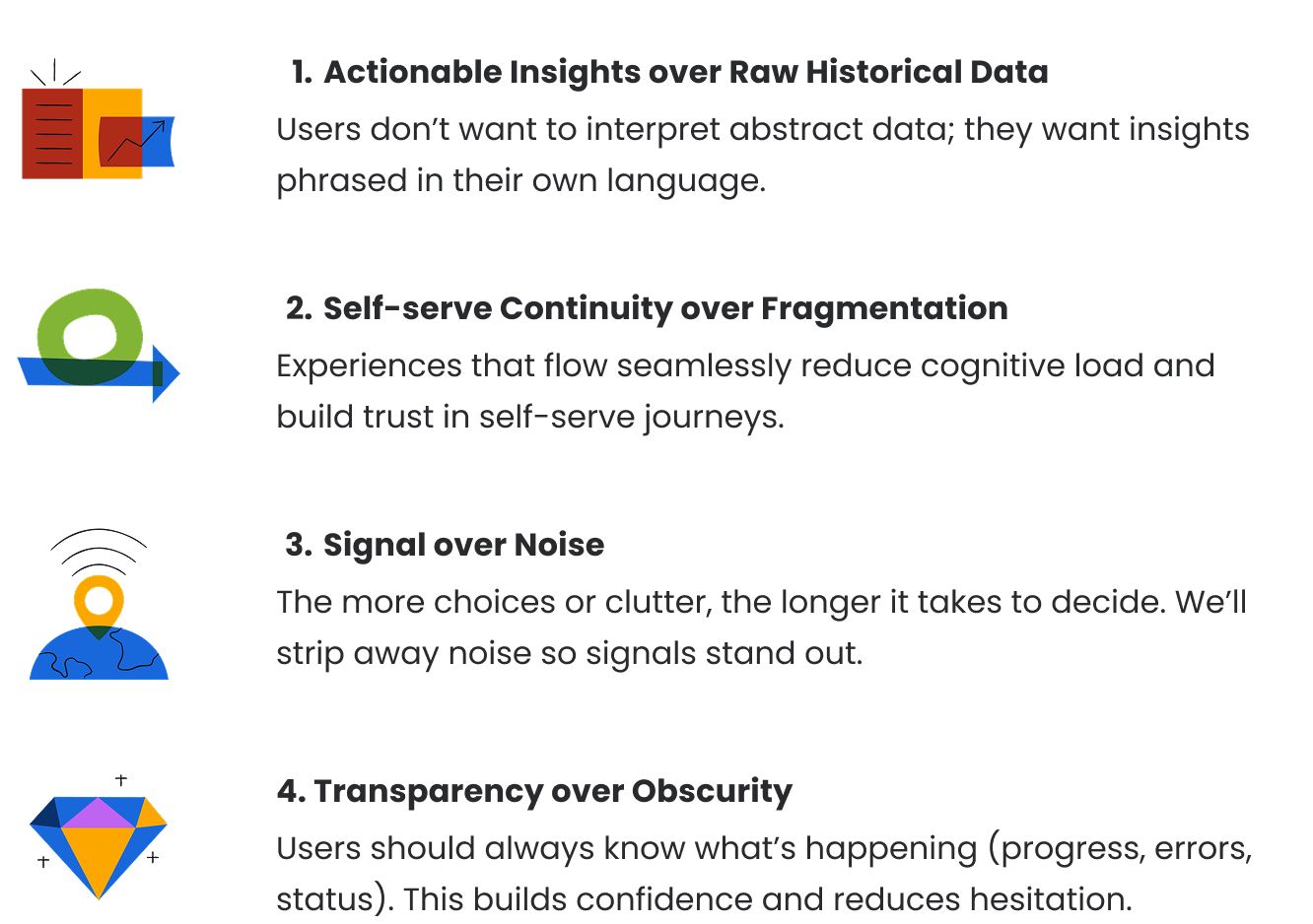
Aligning the System: Design Principles
I ran a workshop with product and engineering to land on four principles that guided how the platform behaved, not just how it looked. They became the reference point for hard calls: when two designs were on the table, which one held the line?
The principles weren't a deliverable. They were a working agreement, used in design reviews, in roadmap calls, and when engineers had to make trade-offs without me in the room.
Step 02
Introducing Structure: Domain-driven Architecture
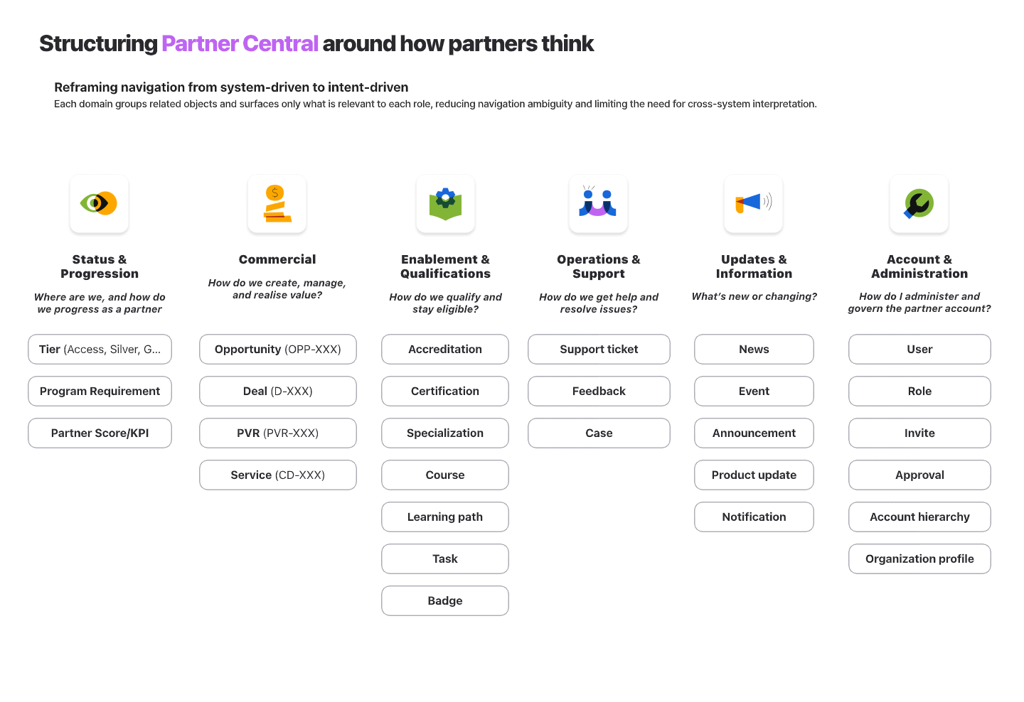
I mapped the six partner roles (Partner Principal, Operations, Sales, Marketing, Technical, Developer) against their jobs-to-be-done and the systems they were stitching together to get them done. The pattern was consistent: partners thought in outcomes, the platform was organised by features, and Partner Managers were filling the gap.
So I restructured Partner Central around six domains aligned to how partners actually operate: Status & Progression, Commercial, Enablement & Qualifications, Operations & Support, Updates & Information, and Account & Administration.
Challenge: Six partner roles, each with different jobs, all using the same platform. Organising by feature meant every role saw everything. Organising by role meant six platforms in a trench coat.
Decision: Organise by domain, not by feature or role. Group the objects and surfaces that belong to a single mental model, then let role-based surfacing decide what to show.
Trade-off: Higher upfront modelling cost, and a harder conversation with engineering about cross-domain dependencies. Some features had to be re-scoped to fit the model.
Impact: A structure that holds as the platform grows. New capabilities slot into existing domains instead of bloating navigation, and partners stop having to translate the system in their head.
Step 03
From Structure to Experience
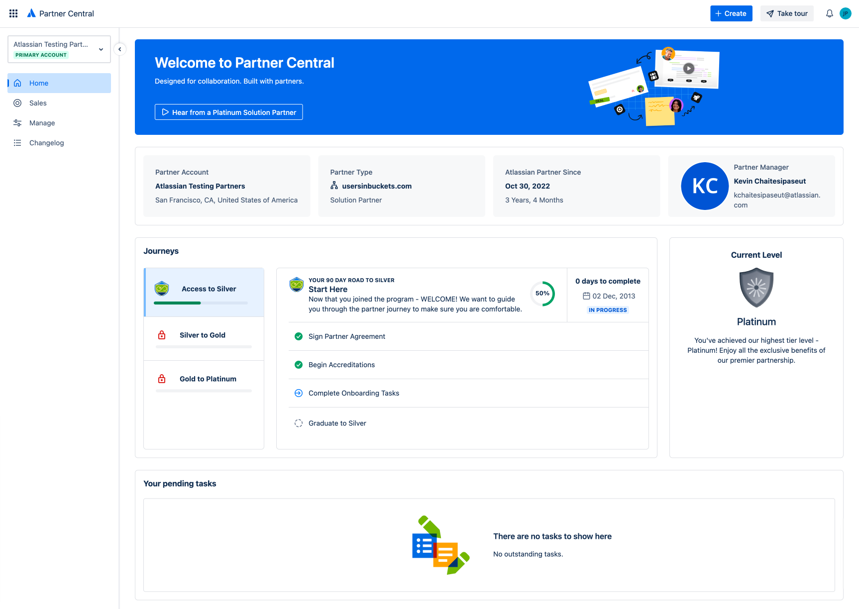
The architecture translated into a role-based homepage that surfaced what mattered to each partner type, with key signals visible on arrival rather than buried two clicks deep.
The Tier Progress Tracker is a good example. Tier requirements had previously been opaque: partners knew there were thresholds but not where they stood against them. The Tracker turned that into something they could see and act on, without asking a Partner Manager to explain it.
Challenge: The same homepage was serving a Sales lead checking pipeline, a Technical user looking for certifications, and a Marketing user grabbing assets. Everyone saw a generic dashboard that served no one.
Decision: Surface what matters to each role on arrival, anchored to their primary domain, with secondary signals available but not foregrounded.
Trade-off: More logic on the homepage, more state to manage, and a harder QA matrix. Personalisation is expensive when you're a beta with two engineers.
Impact: Partners see what's theirs to act on without filtering through everything else. Time to first useful action dropped sharply, and the Tier Progress Tracker became visible to the partners it actually applied to.
Step 04
A Design System Built to Scale
Alongside the platform work, I built a dedicated component library on Atomic Design principles, aligned to the Atlassian Design System but extended for Partner Central's specific surfaces.
This wasn't a deliverable I was asked for. I built it because I knew I wouldn't be the only designer on Partner Central forever, and the team needed something that would let the next designers move fast without re-litigating every pattern. The library outlived the project I built it for.
Challenge: I was the only designer, but I wouldn't be forever. Without a component foundation, every new designer would have to re-derive patterns from the Atlassian Design System and adapt them to Partner Central from scratch.
Decision: Build a Partner Central library on Atomic Design principles, layered on top of the Atlassian Design System rather than parallel to it.
Trade-off: Time spent on infrastructure I wasn't asked to build, and the risk of being seen as gold-plating in a beta context.
Impact: Design quality stayed consistent as new features shipped and new designers joined. The library outlived the project I built it for.
Step 05
Beyond Partner Central — The Revenue Experience Blueprint
Having led the design from zero to one on both Partner Central and Partner Purchasing Center (PPC), I was in a position few others were: I could see the seam between them.
PPC owns the transactional experience (quoting, deals, commercial operations). Partner Central owns the program experience (onboarding, enablement, opportunity registration). But the sales workflow runs across both, and neither platform owns the full picture.
Challenge: Two platforms I'd designed were each coherent on their own, but the partner sales experience ran across both. No single team owned the seam, and no artifact made the cost of that split visible.
Decision: Map the full revenue lifecycle as one system, with clear ownership boundaries between Partner Central and PPC, framed around partner intent rather than platform scope.
Trade-off: Work outside my assigned scope, no formal mandate, and a Blueprint whose recommendations would require organisational alignment across two product teams to act on.
Impact: Gave leadership a basis for deciding what belongs where. Reframed the conversation from “what should each platform build next” to “where should the boundary between them sit.”
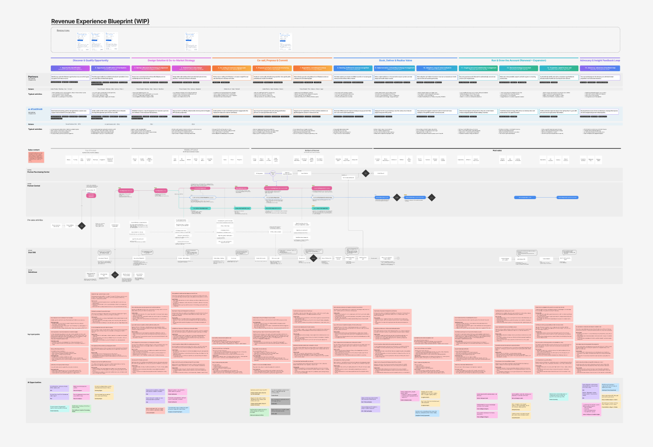
Illustrative structure only. Original content is confidential and not shared externally.
The Revenue Experience Blueprint maps the full partner revenue lifecycle as one system, identifying what belongs where, where the seams should sit, and where revenue leaks through the gaps. It also includes a dedicated swim lane mapping where Atlassian's Partner Graph and AI can accelerate sales, protect margin, and reduce cost across the lifecycle.